Tuesday, June 25, 2013

Fat-Tastic Tuesday Cahllenge #5 - Red, White & Blue w/ Metal

Hello Crafters!

It's Tuesday! That means it's time for another post from my sister blog Fat-Tastic Tuesday where we make 4x4 projects of any kind! Mostly we like to make Fat Pages but we will accept any projects as long as they are 4x4 in nature. Of course you have to follow the theme to get the chance to be a winner.

Our wonderful sponsor for this challenge is:
Eureka has some wonderful stamps in their collection so be sure to stop by their shop.

Now, on with my DT project for FTT.
First, here's the sketch we used this time:

And here's my project.
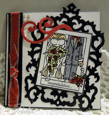
I made this one for my sister in-law who loves kitties and most anything patriotic.  My card stock (red and blue) is from SU of course. The background paper is from my stash. Looks like fireworks doesn't it?  I used a clear stamp set for the the zigzag stitching from The Paper Studio Clear Stamps.  My metal is the the star brads which I had to color silver with a sharpie because I didn't like the way the gold color looked with this card. I let it dry a bit because the metal is just a little slickery. Then I added them to the circles that are partially tucked under the background paper. I used my Spectrum markers to color my image and layered that on card stock cut with a nestabilities scallop die.  I stamped the sentiment from another word stamp set from Paper Studio Clear Stamps. That particular set is worth it's weight in gold! Anyway, the image and the scallop are popped up on foam tape to add a bit of dimension. I thought I would add some bling to bring out the sparkly shiny a bit. Pretty simple card really but, I think I am happy with it. SIL will love it no matter what anyway.

Thanks for taking the time to hang out with me today. We would love to have you follow our new blog Fat-Tastic Tuesday and take part in our challenges. Eureka is offering 5 digi images of choice to our winner for this challenge. The challenge will run a full two weeks so get on over there and check out the DT's inspirations and get started. Remember, you can enter two times each week.

Happy Crafting!

Monday, June 24, 2013

Artistic Inspirations Challenge #47 - Fur or Feathers

Hello Crafters!

Today marks a new challenge at Artistic Inspirations and we have a really fun theme this time. Your creations should include fur or feathers. Our wonderful sponsor is
Be sure to visit our sponsor's shop for some lovely images.

For my project I wanted to do something different so I decided on a piece of jewelry.
 The image I used for this lovely lady is called "Feather Flourish". Isn't she cute? I had to shrink the image down to less than an inch to fit in the frame. I picked the smallest feathers I could find to fit the lady's hat and used just a touch of adhesive to hold them into place. I also added a feather to the back side for interest. I then placed this piece between to glass slides (Ranger) and put in the frame. The bale and chain are from Hobby Lobby and the beads are from my stash. I glued the beads down with just a tiny bit of crystal lacquer. The beads hanging at the bottom were added last for a little pizazz.

Sadly, this will be my last project for Artistic Inspirations challenge blog as it is time for me to move on. I will be working with a new blog soon for altered projects so stay tuned for more information on that. I have enjoyed my time with Abbie and the team and will continue to follow the blog. Now stop on over and take a peek at the rest of the DT projects and we hope you will want to play along as well.

Happy Crafting!

Sunday, June 23, 2013

Eclectic Ellapu Challenge #35 - Recipe, 1 Image, 2 Embellishments, 3 Papers, 2 Die-cuts

Hello Crafters!

It's time for another challenge at Eclectic Ellapu and Andria is heading up the challenge this time. She has chosen a recipe for you to follow. This was a fun one for me as I tried a new product. Well, I have actually had it around a while and decided it was time to use it. It's called Honey-Pop from Inky Antics. It's really fun to use. I chose to use it in a non-traditional way and make a flower.
 There are clear stamp sets to use in making several different types of flowers and images but today I used a scrap left over from making another project. The paper is like a honeycomb which I stretched out then flattened out after cutting my shape. Then I joined the two ends and formed a circle similar in the way you would do an accordion flower. I then layered this onto the die-cut flower (SU) and topped with a large cloth covered brad from my stash. The leaves of the flower are from a Tim Holtz wings die. The butterfly image (SU) was stamped and punched out and popped up on foam tape. The sentiment was stamped and punched out with a new bundle set from Stampin Up and popped up as well. My papers are from a K & Co. book I got last year as a gift. The background is one piece and the strips are from another piece to which I added a yellow card stock strip. All of this is layered on Bashful Blue card stock.

Elements in my recipe:
1 Image: butterfly (stamped)
2 Embellishments: cloth covered brad, sentiment
3 papers: background, strips, purple flower
2 Die-cuts: white flower, leaves

Thanks for stopping by today. Please also stop by Eclectic Ellapu and check out the other DT projects then join in our challenge, you know you want to!

Happy Crafting!

Tuesday, June 18, 2013

Fat-Tastic Tuesday Challenge #4 - Inspiration Week - Father's Day w/ Natural Elements

Hello Crafters!

Challenge #4 Inspiration week has begun over at Fat-Tastic Tuesday and we hope you will want to play along.

My image this week is not as "manly" as last week. However, I think there are plenty of fellas out there that like flowers so I gave this one a shot. Now, just to make it a little less feminine I did add some metal elements to my project. Take a look.
I used Basic Gray card stock for my base and the blue-ish color on the right both from Stampin' Up. The designer paper is also from SU. The image is from Robyn's Fetish, our sponsor for the current challenge. The eyelets on the right are humungous! I can't even tell you where I got them. I do love the odd shape they took on when I pounded them into the paper though. I added a couple of bling dots at the top of my image to help the eye flow downward. I colored my image with Spectrum Noir markers as usual and layered on gray card stock then popped up on foam tape. I added the pin dots in the center of the flower with my Millineum pen. The wire at the top of my project is just soldering wire cut and twisted then attached with tiny glue dots. Lastly, I hand printed the sentiment on white, punched out with a small oval punch (SU) and popped up on a gray oval (punched from gray - SU). 

So, there you have it. My inspiration for this week. Hope you like it. Stop over to Fat-Tastic Tuesday and check out the participating DT projects. They're great! Don't forget to upload your entries, you still have a few days left!

Happy Crafting!

Tuesday, June 11, 2013

Fat-Tastic Tuesday Challenge #4 - Father's Day w/ Natural Elements

Hello Craftrs!

I am loving the challenge this fortnight at Fat-Tastic Tuesday. First I love to make cards for the guys because... well, lets face it, we just don't do it often enough. Second, I love the image I chose from our sponsor Robyn's Fetish.
Please stop by her shop and check out
the other great images she has available.
I guess I was thinking about my Father-in-law this time as he loves to go fishing and that sort of stuff but just doesn't get to do it as much anymore (he'll be 82 this year). Anyway,
I chose the image "Just Ducky"
and used this sketch

Of course you can see I rotated and flipped the sketch this time.

I am so loving the way this card turned out. Everything I used was from my stash except the card base  which is Not Quite Navy - Stampin' Up - discontinued :-(.  The tree stamp is also from a set from SU but I can't remember the name of it. I stamped it in Old Olive first then went back over it with my SU marker in chocolate Chip to make the branches stand out a bit more. I made the little beady flowers (I just used craft glue to secure them) from my bead stash and purposely understated them. This is a guy card after all. I had bought some wide burlap ribbon and cut a small piece to layer under my sentiment (SU - really old set but one of my favorites) and frayed the edges a bit. Of course, I used my spectrum markers to color Mr. Ducky. I had to go searching for a picture of a duck so I would know how to color this little guy as I wanted him to look fairly close to real. So, how did I do?

I hope you will stop over to Fat-Tastic Tuesday and check out my fellow DT members projects too as they are great! Why not make a 4x4 project and join the challenge with us? We would love to see what you create!

Happy Crafting!


Monday, June 10, 2013

Artistifc Inspirations Challenge #45 - Stitching Real/Faux

Hello Crafters!

We have another great challenge at Artistic Inspirations this week. Our lovely sponsor is:
Robyn's Fetish has a great shop of images and is offering a great prize for the winner of this challenge.

I chose to use "Dragon Fly Day" for my project. I just love dragonflies. They're the next best thing to butterflies and ya'll know how I feel about those! I colored the image with my Spectrum markers and added some Champagne Mist paint (SU) from my sprayer bottle for little shimmer on the dragonfly's wings. Love that stuff. So sad that is was discontinued in the new catalog.

I started with the largest scallop circle from Spellbinders Nestabillities for the image base. After coloring it I added the machine stitching.
The card base (Cool Caribbean) is from the same scallop circle but the card was folded in half and slid down a bit before die-cutting so I could get a fold without using an extra piece of card stock. The base front was then folded in half and the image base was attached at the bottom only so it would pop up when opened:
 
I used the smallest scallop circle for the sentiment backing (Close to Cocoa - SU) and used a circle punch for the thank you sentiment (SU) on the Cool Caribbean (SU) card stock and popped that up on the brown. The brown flowers were punched from 3 size scallops (Paper Studio & SU). The smallest one is from the Boho Blossom punch (SU). I inked the edges with Tempting Turquoise and added the bling.
The inside (cut with the next smallest die-cut scallop) was stamped with the coordinating sentiment. I added the ribbon by cutting slits in the white layer before gluing to the base. I added the bling to the inside to hold the card front in place. The ribbon did this nicely as well but I wanted the recipient to have choices.

Well, that's my inspiration for you today for Artistic Inspirations. Stop over and see the other DT members inspirational projects. Don't forget to join in the challenge - Robyn's Fetish has a great prize.

Happy Crafting!

Sunday, June 9, 2013

Eclectic Ellapu Challenge #33 - B is for...

Hello Crafters!
Well it's Sunday and that means Eclectic Ellapu has started a new challenge. This time my Purple Teamie Bonnie has chosen our theme.  "B" is for...

Bumble Bee Buzzin By, Bling, Black (card stock &  ribbon)
I couldn't resist making this cute little bumble bee when I saw one similar to it on a blog somewhere. I love using my punches creatively so this was a perfect chance for me to play.

I picked up the hexagon embossing folder with a coupon at Joann Fabrics. Wasn't sure I would ever get this folder but when I saw the bumble bee I knew it would be a great companion. I used a special technique that I've thought about for some time but never tried. Since I made this card I saw the very same technique in the summer issue of Cardmaker Magazine. Great minds????

All I did was mix about 1/4 teaspoon of crystal lacquer (Diamond Glaze for you SU followers) and a drop of stamp pad reinker. I mixed it up good then applied it to the "honeycombs". This was the last thing I did after figuring out the layout so I could let it dry and not take a chance of messing it up. I used a very small paint brush to apply but, I didn't get very even coverage so I might just use a toothpick next time. 

The card base is Basic Black and the embossed layer is Summer Sun both SU colors. The bumble bee is made from the ornament punch (the older one), 1-1/8 circle punch, & the small and large oval punch. I punched the body in Summer Sun and Basic Black with the ornament punch. The basic black just gave a layer to help it stand out against the yellow card stock. I used the large oval punch to make the stripes and trimmed a bit off. I used the small oval to punch out the wings from some old printed vellum from SU. I sprayed that with Glimmer Paint Spray (no longer available - boo hoo!). It really made the wings shine. Not sure how well you can see that. Anyway, I applied the black circle over the wings and added black bling for the eyes (didn't want them to stand out too much). A little swish of my white gel pen added some highlight around the eyes and on the wings. The antenna are just little slivers of black card stock attached with a glue dot.

The bee was popped up on foam tape as was the sentiment. But, I felt the card still needed a little something. When in doubt add ribbon.  So, I added ribbon to the top and tied a knot.

Hope you have been inspired to create a "B" card for our challenge at Eclectic Ellapu. Be sure to check out the DT inspirations - you won't be disappointed! What's your "B" going to be?

Happy Crafting!

Tuesday, June 4, 2013

Fat-Tastic Tuesday Challenge #3 Inspiration Post

Hello Crafters!
I'm back with another post for Fat-Tastic Tuesday. We're slowly getting the word out there about our challenge and I know it won't be long before everyone will be playing along.
 
 So, you may remember the theme is Wedding with die-cuts, lace and pearls. I know I don't actually have any lace on this card but, the large die-cut is pretty lacy so I went with that. The beautiful die-cut I used is from Spellbinders (remember when I won it last year?). Our sponsor is Bugaboo (gotta love those images) so I picked "Snappy Congratulations" for my inspiration this week. I also used a little swirl die from SU - the name of it escapes me at the moment. Anyway, The pearls are from SU also. I used my Spectrum markers for coloring and I also added some Champagne mist paint on the grooms shirt, the accents on the brides dress & pearls then added a little to the pearls in the corner. It really brought everything together. I used white, basic black & basic gray card stock for this project. I love the accents of red all over this card and the little bit of sparkle on the red ribbon.

A friend of mine told me about a trick when using die-cuts a long time ago that I just never used. This time I used the idea and the results were fabulous. All you have to do is use wax paper when die cutting. Make sure the wax paper is next to the die when you run it through your machine and you will have great results. Perfect for those dies with the little pieces that always seem to get stuck. Now that I have used this technique I will probably get more use of my intricate dies (I hated picking out all those little pieces).

Hope you enjoyed my project today. Be sure to stop over and join up with the challenge over at Fat-Tastic Tuesday - Bugaboo is offering some great prizes!

Happy Crafting!